Syracuse University
© Brand Design Evolution
Visual Identity Development
Motion Design System
Campaign Design
Evolve the Syracuse University brand toolkit for motion campaigns (across social media, TV and signage) and then leverage these tools to build high impact digital campaigns.
In our ongoing relationship with Syracuse University, we have created tools to help the SU Marketing team bring campaigns to life targeted both to prospective students as well as to donors and the current student body.
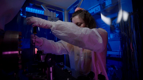
Who is the target audience for Universities? Teenagers.
They learn about things on social and they gain exposure to colleges less through print brochures today and more through social and video content. For universities to attract the candidates they want, they need to successfully convey who they are and what they stand for.
And this is where we come in to the picture.
Before beginning work, we examined the competitive landscape, looking at how and what other relevant University brands were communicating. We presented a discovery report to Syracuse along with our initial ideas on how we could best reflect their brand attributes through their marketing across social & digital.
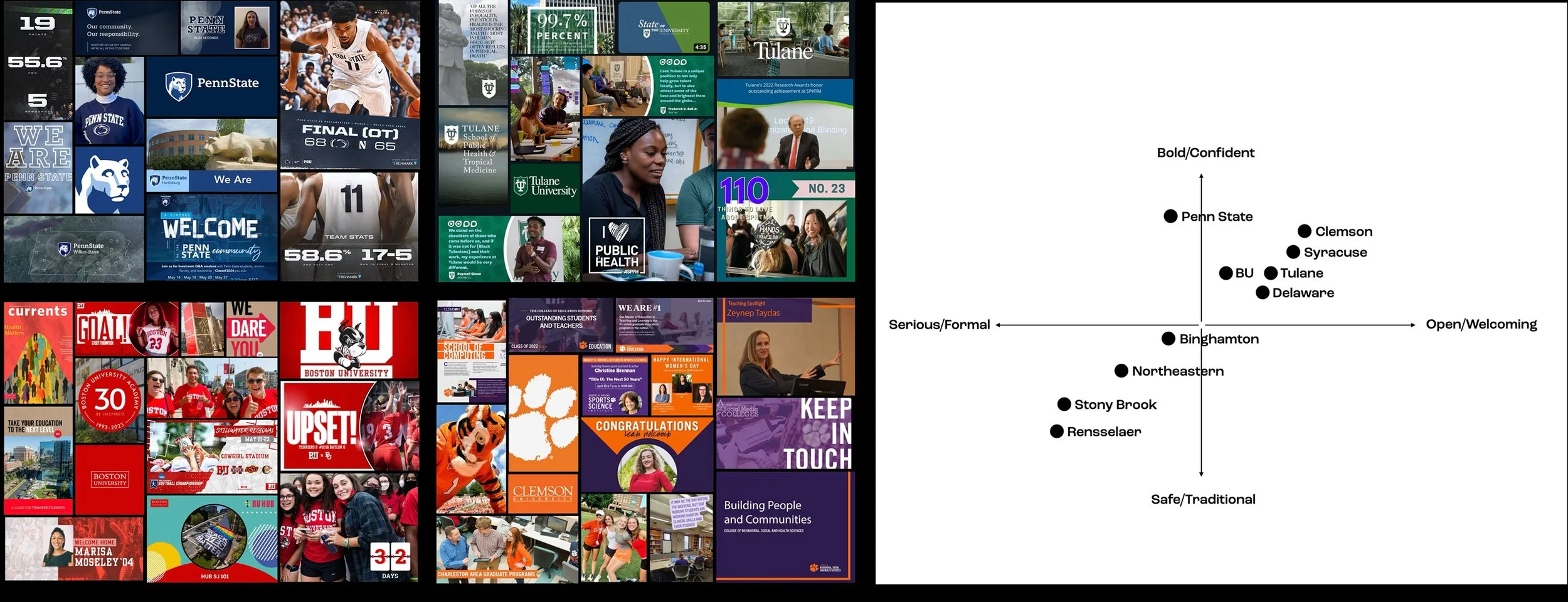
The key word we used to distill the brand positioning in a way that could be interpreted in motion was “discovery.” To find common ground between attributes like ‘bold’ and ‘welcoming,’ we suggested the brand needed a motion design that blended hard and soft motion in the reveal of the hero “S”.
MOTION THEME:
DISCOVERY
Our motion language is designed to evoke a spirit of discovery, of revelation. In logo stings, the S form emerges from a single angle, giving it the feeling of emerging, unfurling. The offset branches of the S gives it an organic quality for a welcoming warmth consistent with our brand.


Whatever the element we are animating, whether it’s transitions or typography, we strive to express this feeling of opening up, revealing more layers, or lifting you in a way that evokes that “Ah-ha!” moment you associate with learning and discovering new things.


There is range in the logo treatments it uses. For formal contexts, Syracuse uses a heritage seal. When reaching out to new students, the block S is more common.
Depending on the occasion and audience, Syracuse needed a range of expression. We built custom motion toolkits for the university that range from more formal examples to more expressive ones. They vary both in terms of how they use typography but also how they move.


Sample motion from our custom motion toolkit. We featured upward motion as well as reveals using the angles in the logo. (The Otto Hop is an homage to SU’s athletic mascot Otto)
Precise grid systems & guidelines were established for the scale and placement of lower thirds, typography, color and logos, creating consistency across everything from spots to digital banners to social posts.
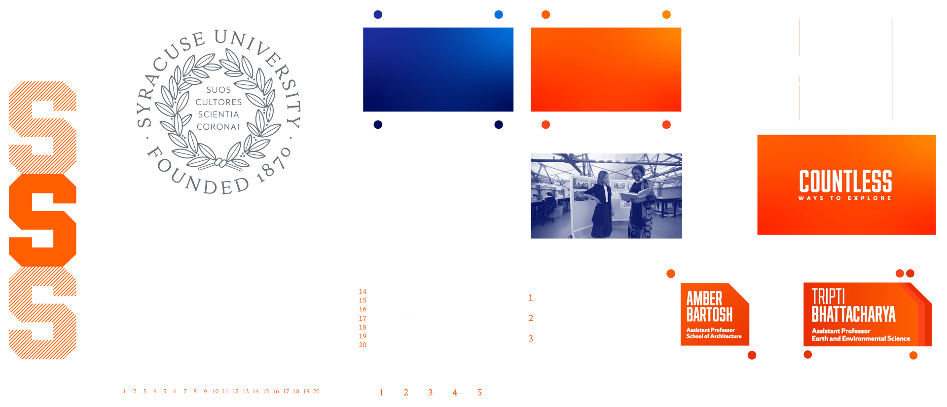
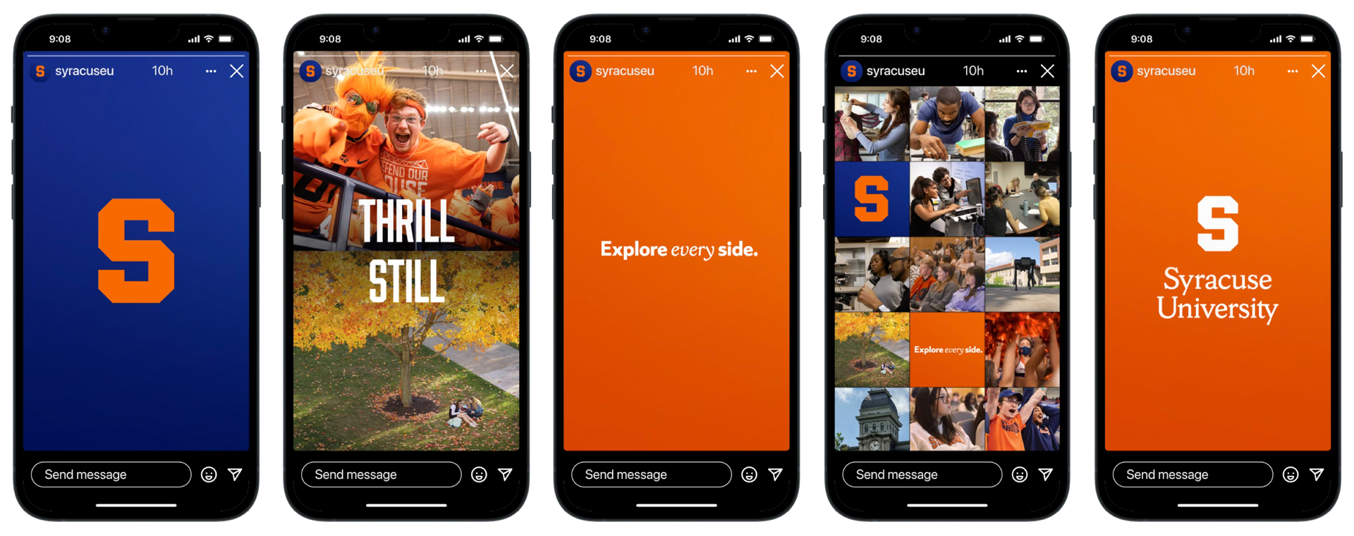
We also worked on a campaign featuring the line “Explore every side.” The work aims to highlight the multi-faceted opportunities that set the school apart from the competition.
As we built out messaging toolkits, we also created a comprehensive library of just under 200 animated icons to be used for info loops and other university communications.
We developed a design & animation system to be used for creating longer form pieces directed at alumni and donors, allowing them to feature key stats about the school in a way that's dynamic and impactful.