Branding
More than the sum of its parts.
A brand is more than a logo. More than a color palette and typographic choices. It is also about behavior, context and discipline. It is about a state of mind. Looking at a brand holistically brings together our various skills and interests and allows us to codify all the different elements that make a brand, well, a brand.
© LOGO DESIGN
| CUSTOM FONTS
> ANIMATION
-
We take “words on a page” and turn them into a conceptual platform upon which the brand is built; an actionable framework that informs current and future brand creative.
-
Whether it’s a logotype, a brand mark or a combination of both, the “logo” is at the heart of any brand identity. Our expertise in designing for screens leads us to craft logos that hold up at small sizes and captivate at large scales.
-
We use our expertise in graphic design, animation and the media landscape to craft dynamic and agile brands that have the ability to adapt to ever-evolving platforms and technology.
-
Whether it’s defining usage guidelines for existing fonts or crafting custom type families, we approach typography as a key pillar of any brand identity.
-
Screens have become ever-more prominent in our lives. Therefore, brands need to tell better stories on more platforms. A codified animation language is a key component in defining the behavior of a brand across multiple touch points.
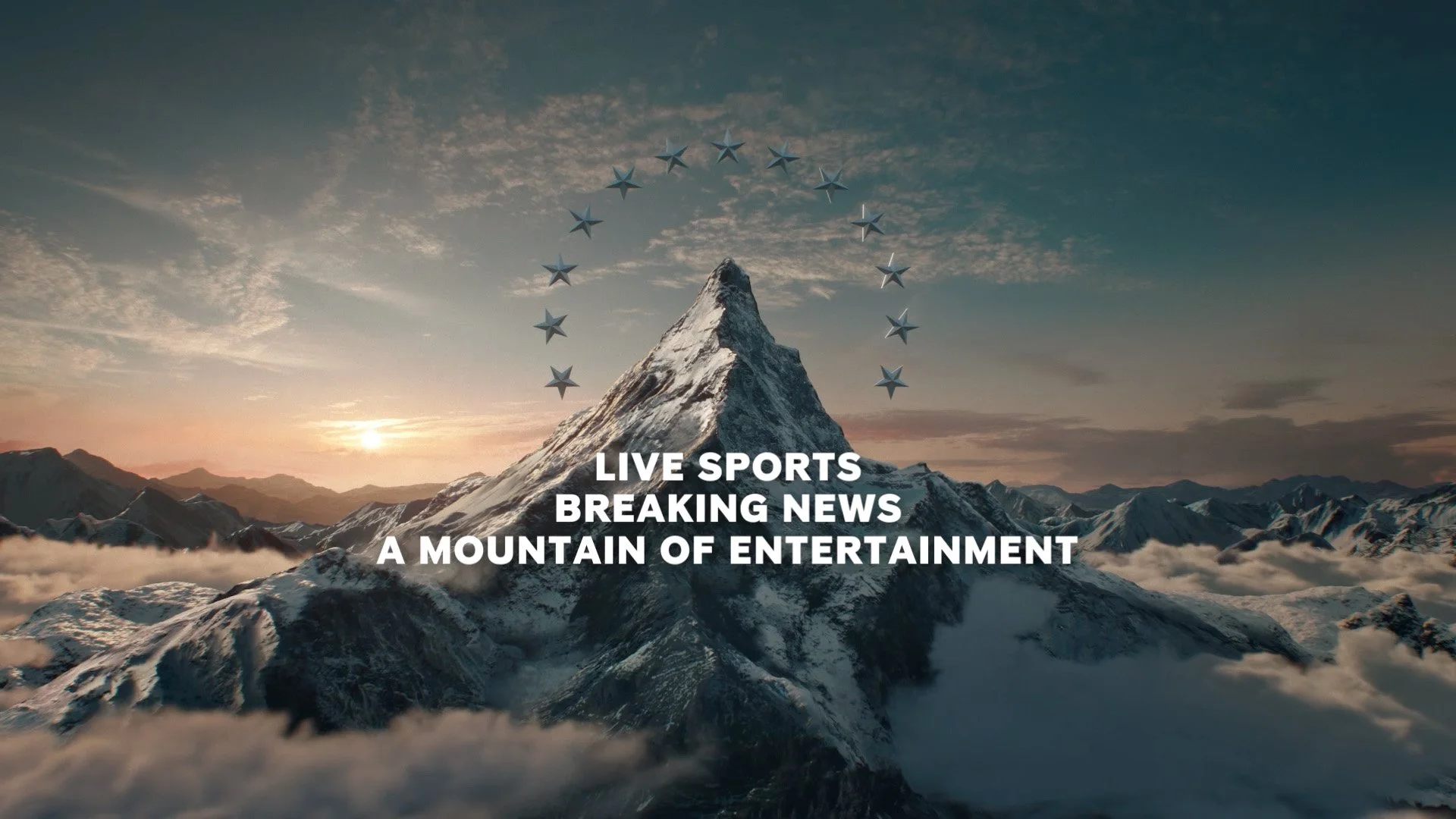
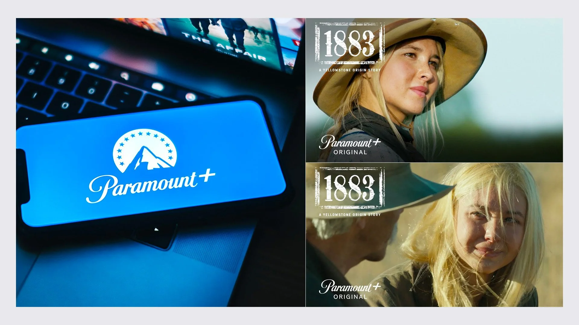
PARAMOUNT+ © Brand Identity™
The newest entry into the “streaming wars”, Paramount+ is a modern brand built on the equity of the iconic film studio and the vernacular of the theater experience. Complete with reimagined MOUNTAIN MONOGRAM, custom typeface and refreshing blue.


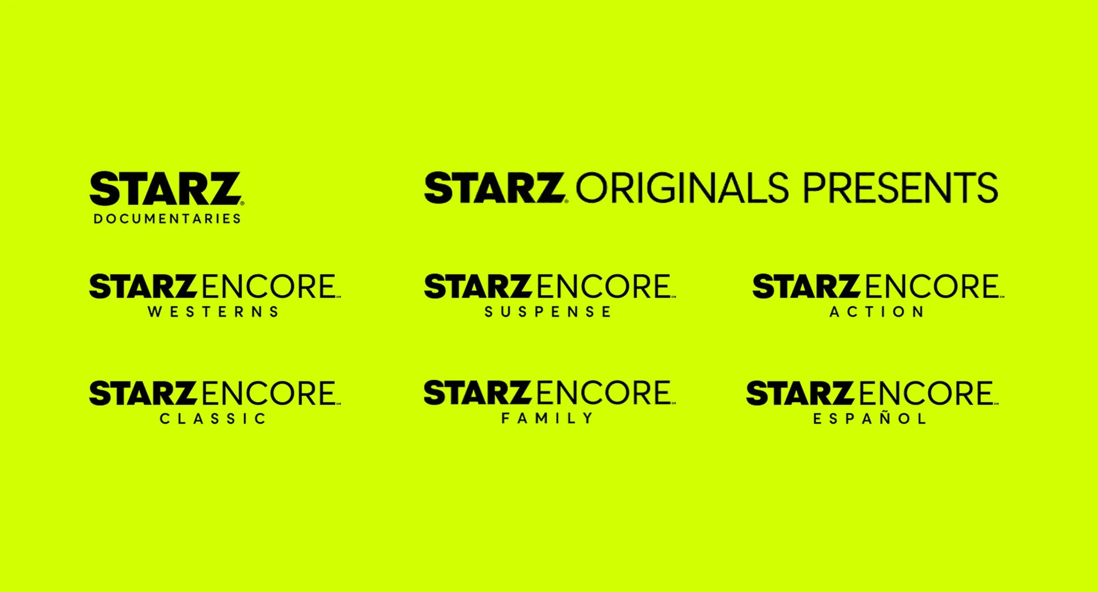
STARZ © Brand Identity™
Working with Starz on a comprehensive global rebrand, our work ranged from articulating brand strategy and developing voice guidelines to refining the logo and developing a multi-platform design system that would come to life across linear and streaming platforms, both here in the US and internationally, via the app Lionsgate+.


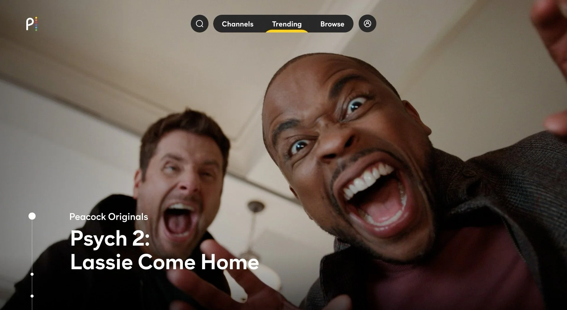
PEACOCK © Brand Identity™
Following a string of successful endeavors with NBCUniversal, we were thrilled to be tapped as the branding partner for their new streaming service, PEACOCK. We collaborated with NBCU in the early stages of the process to develop a strong brand for Peacock that would establish its own presence in the streaming market while invoking NBCU’s rich history.


MTV © Brand Identity™
For only the third time in its glorious history, one of the most iconic brands in the world revisited its identity, taking a holistic look at the brand across all touch point. This process led us to a remastered MTV hero logo, restored to its original anti-corporate vibe, a revamped brand architecture, and completed with GRAVITY GROTESK, the first and only custom font to be implemented globally.


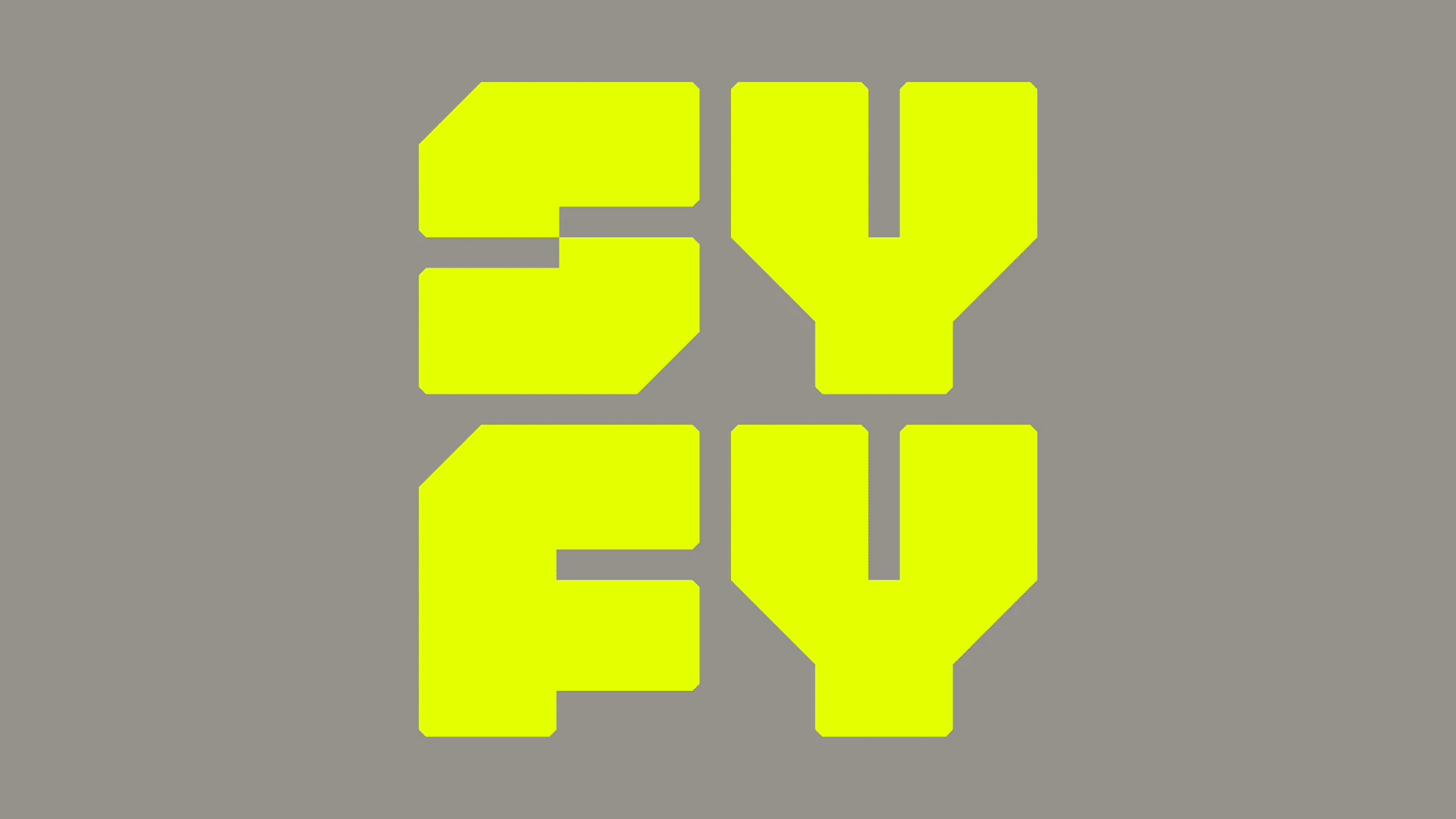
SYFY © Brand Identity™
To celebrate their 25th anniversary, SYFY recommitted itself to the sci-fi genre and its millions of passionate fans by embracing and celebrating more than just their own original content, but all things genre. We had the privilege of contributing an entirely new visual identity for the network, including a new logo, custom typefaces and tactical innovations that form the backbone of the brand across all linear, digital, social and experiential platforms.


MAGNOLIA NETWORK © Brand Identity™
Translating an iconic magazine & lifestyle brand into robust content provider is a thrilling, yet challenging endeavor. Discovery entrusted us with shepherding MAGNOLIA NETWORK, its latest addition to the network family, through this evolution. We helped the brand finds its home within the existing Magnolia universe, drafting the outline of the next chapter in its epic brand story.


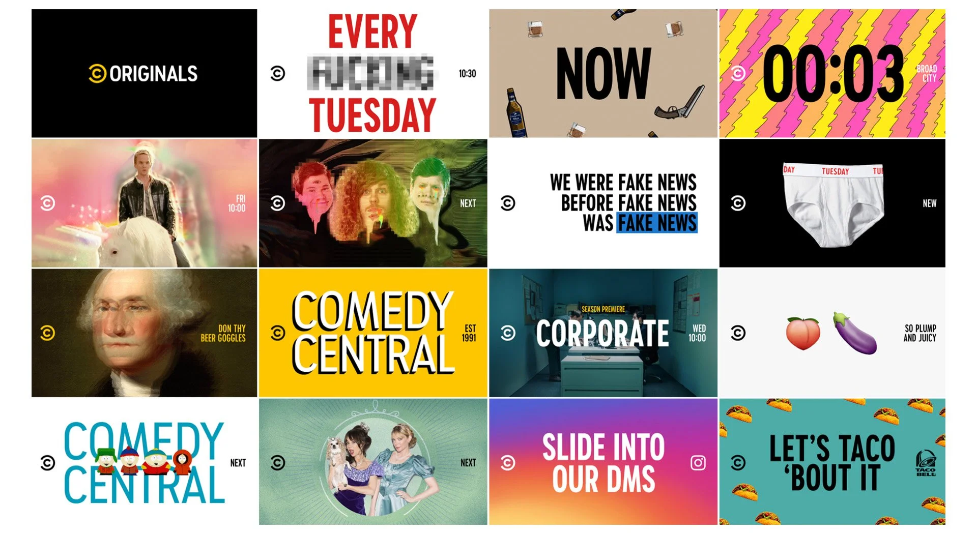
COMEDY CENTRAL © Brand Identity™
In today’s multi-platform landscape, if something smells promotional, you’ll swipe right past it. This is especially true for comedy. Our goal was therefore to CLAIM OUR CONTENT WITHOUT GETTING IN THE WAY; communicate information to the viewer in a way that would maximize time spent on punchlines, not end cards. Ultimately we aimed to NOT MAKE PROMOS, or more precisely to redefine them as FUNNY CONTENT in and of themselves.